01 · FinTech · Cross-border payments · Mobile
SabaPay
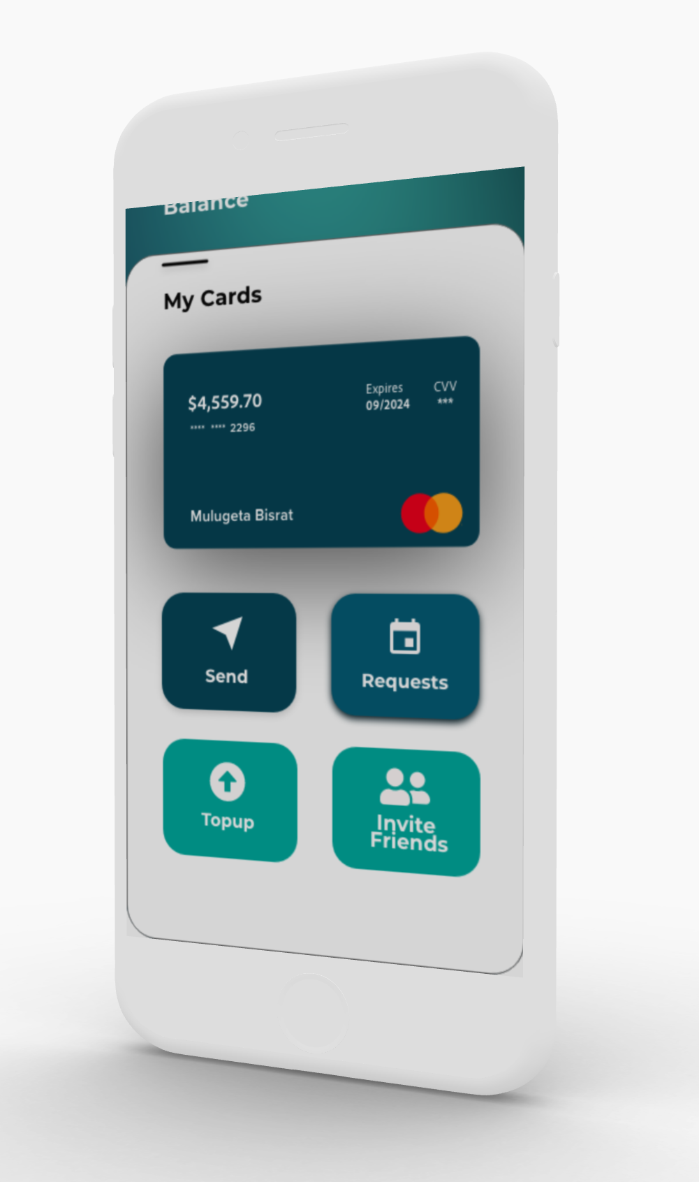
A mobile payment app for cross-border payments in East Africa
- 60%lower transaction costs
- 85%faster onboarding
- 6key pain points identified
1. Problem
Small businesses in East Africa (20 employees or fewer) couldn't find a reliable, affordable way to send and receive payments across borders.
Banks and money transfer services charged high fees, took a long time, and made the process complicated. That held back growth and kept many businesses outside the financial system.
High costs
Fees of $30 or more per transfer cut into small profits.
Slow processing
Transfers took 7–10 days, disrupting cash flow.
Poor experience
Complicated apps weren't designed for these users.
The market
- 68% of small businesses in East Africa rely on informal money transfer
- A transfer costs 12–15% of the amount on average
- 45% of businesses delayed payments because of cost
- Many target users have limited experience with digital tools
The effect on businesses
- Profit margins 10–15% lower
- Cash flow problems that disrupted operations
- Hard to grow across borders
- Reliance on risky informal channels
2. Research
Primary research
- 24 in-depth interviews with small business owners
- 3 focus groups in Kenya, Ethiopia, and Uganda
- Observation at money transfer locations
- Survey of 150+ business owners
Secondary research
- Review of 12 competing products
- Financial inclusion reports and data
- How people in East Africa use mobile phones
- Review of the regulations
What we learned
- Trust matters most. 78% of users valued trust and security over convenience. Bad experiences with digital payments had made them wary.
- It had to be mobile. 89% of target users go online mainly on their phones.
- Simple beats feature-rich. Users preferred a few features that work well, with clear, simple steps.
Personas
Alex Grassimov
Game designer and CEO · Toronto / Ethiopia
"I don't have to be constantly worried about making a payment or receiving a payment."
Goals: pay employees on time, keep fees low, and track payments.
Frustrations: expensive transfers, no way to track them, and problems with identity checks.
Saba Kahsay
Civil engineer and trader · Dubai / Ethiopia
"Payment transaction is the oldest human activity."
Goals: easy transfers, better exchange rates, and a simple interface.
Frustrations: hard-to-understand design, slow processes, and too much text.
3. Approach
The design focused on trust, cultural context, and showing advanced features only when needed, so the app would work for people with different levels of digital experience.
Build trust first
Show fees clearly, make security visible, and use familiar patterns.
Show features gradually
Keep the main steps simple, and keep advanced features out of the way until needed.
Fit the culture
Use local content, familiar ways of talking about payments, and colours that suit the market.
Design principles
-
Be transparent
Show every fee, step, and timeline up front.
-
Keep screens simple
One main action per screen, little text, and a clear visual order.
-
Prevent and recover from errors
Clear error messages, undo options, and confirmation before important actions.
4. Prototypes & iterations
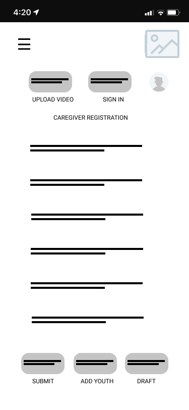
The process moved from user flows to wireframes, prototypes, testing, and changes, backed by a Figma design system. The system covered colours chosen with local culture in mind, typography for several languages, spacing and grids, and icons. Its components included form fields with validation, buttons, transaction cards, and navigation.
Three major changes
-
Simpler onboarding
The first version had 7 onboarding steps, and 60% of test users had dropped out by step 4.
- Change:
- Cut it to 3 essential steps and let people finish their profile later.
- Result:
- 78% fewer people abandoned onboarding.
-
Showing fees earlier
Users didn't trust the app when fees only appeared at the final confirmation step.
- Change:
- Added a fee calculator with a full breakdown to the home screen.
- Result:
- 45% higher trust scores.
-
New colours
The original blue tested poorly in focus groups because of what the colour meant locally.
- Change:
- Switched to teal and green, colours linked with prosperity and growth.
- Result:
- 32% better brand perception scores.
How we tested
- Moderated usability tests with 18 participants
- Unmoderated remote tests in Maze
- A/B tests of key steps
- Accessibility tests with screen readers
What we measured
- How many people completed each task
- How long a typical transfer took
- How often errors happened, and how often people recovered
- System Usability Scale (SUS) scores
5. Solution & impact
Main features
- Instant cross-border payments
- Competitive exchange rates with clear fees
- Wallets in several currencies
- Transaction tracking and history
- Saved recipients
What was new in the design
- An interface shaped by local culture
- Onboarding that asks for information in stages
- A visual design built to earn trust
- Main features that work offline
- Support for several languages
- 60%lower transaction costs than traditional remittance
- 85%faster onboarding, from 2 hours to 15 minutes
- 4.6/5user satisfaction, from 200+ beta users
- 73%of first-time users completed their tasks
Business impact
- Launched in 3 countries, with 5,000+ active users in the first 6 months.
- Featured in TechCrunch Africa; won "Best FinTech UX" at the African Tech Awards.
- Processed $2.3M in transactions, with users growing 40% month over month.
What users said
"Finally, a payment app that understands our needs. I can pay my Ethiopian team without worrying about hidden fees or delays."
Alex G., game studio owner
"The interface is so simple my grandmother could use it. And the fees are transparent — no surprises at the end."
Saba K., civil engineer and trader
See the full visual case study on Behance