Work / Product design

Product design case studies

Three projects, each told in the same order: the problem, the research, the approach, the prototypes, and what happened. They cover a payments app, a piece of hardware, and a platform for young people and their caregivers.

  1. 01SabaPayFinTech · mobile
  2. 02LumosIoT · hardware
  3. 03IMFTOSocial impact · mobile
  4. 04Design leadershipTeams · systems

01 · FinTech · Cross-border payments · Mobile

SabaPay

A mobile payment app for cross-border payments in East Africa

  • 60%lower transaction costs
  • 85%faster onboarding
  • 6key pain points identified
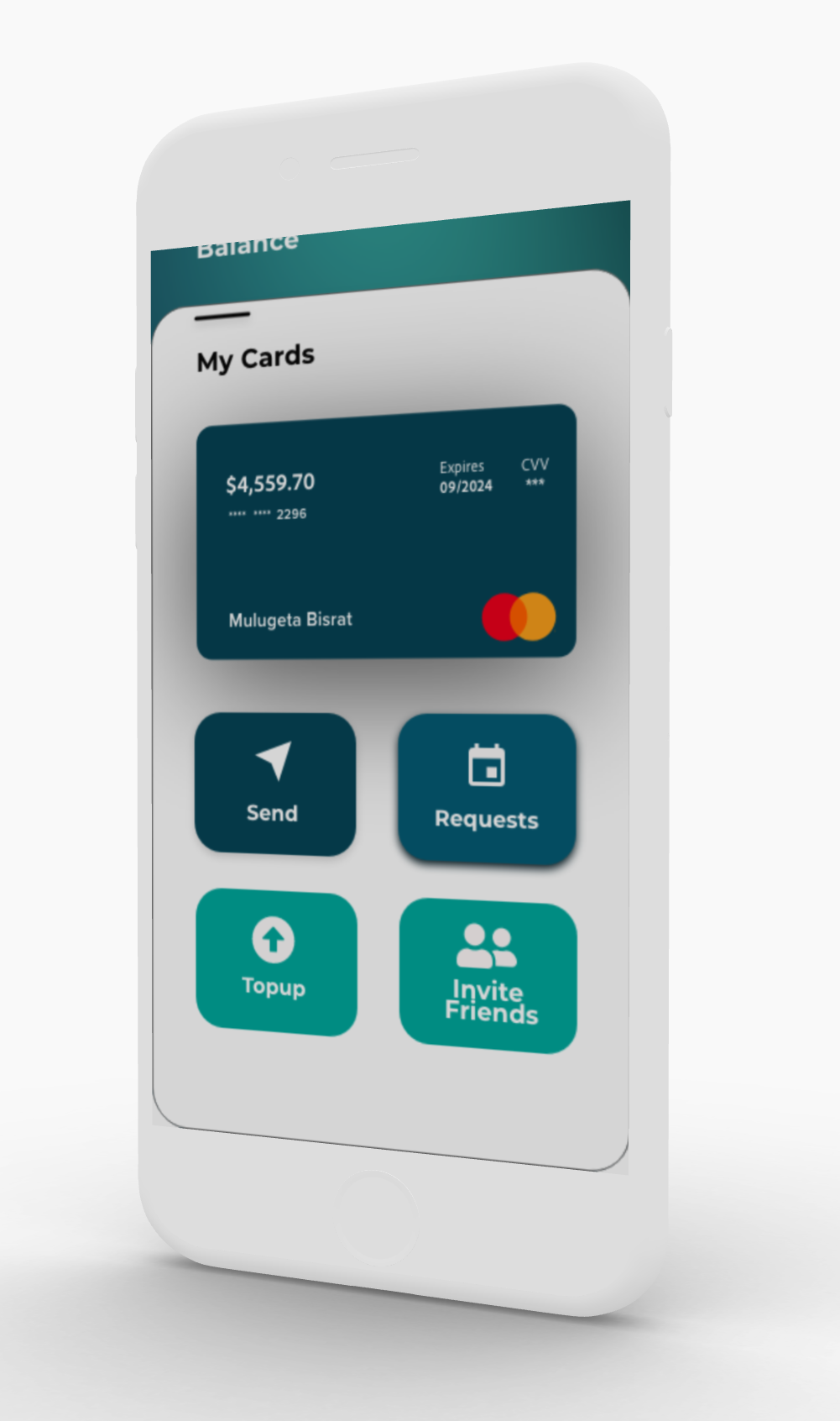
SabaPay app screens

Small businesses in East Africa (20 employees or fewer) couldn't find a reliable, affordable way to send and receive payments across borders.

Banks and money transfer services charged high fees, took a long time, and made the process complicated. That held back growth and kept many businesses outside the financial system.

High costs

Fees of $30 or more per transfer cut into small profits.

Slow processing

Transfers took 7–10 days, disrupting cash flow.

Poor experience

Complicated apps weren't designed for these users.

The market

  • 68% of small businesses in East Africa rely on informal money transfer
  • A transfer costs 12–15% of the amount on average
  • 45% of businesses delayed payments because of cost
  • Many target users have limited experience with digital tools

The effect on businesses

  • Profit margins 10–15% lower
  • Cash flow problems that disrupted operations
  • Hard to grow across borders
  • Reliance on risky informal channels

Primary research

  • 24 in-depth interviews with small business owners
  • 3 focus groups in Kenya, Ethiopia, and Uganda
  • Observation at money transfer locations
  • Survey of 150+ business owners

Secondary research

  • Review of 12 competing products
  • Financial inclusion reports and data
  • How people in East Africa use mobile phones
  • Review of the regulations

What we learned

  • Trust matters most. 78% of users valued trust and security over convenience. Bad experiences with digital payments had made them wary.
  • It had to be mobile. 89% of target users go online mainly on their phones.
  • Simple beats feature-rich. Users preferred a few features that work well, with clear, simple steps.

Personas

Alex Grassimov

Game designer and CEO · Toronto / Ethiopia

"I don't have to be constantly worried about making a payment or receiving a payment."

Goals: pay employees on time, keep fees low, and track payments.

Frustrations: expensive transfers, no way to track them, and problems with identity checks.

Saba Kahsay

Civil engineer and trader · Dubai / Ethiopia

"Payment transaction is the oldest human activity."

Goals: easy transfers, better exchange rates, and a simple interface.

Frustrations: hard-to-understand design, slow processes, and too much text.

The design focused on trust, cultural context, and showing advanced features only when needed, so the app would work for people with different levels of digital experience.

Build trust first

Show fees clearly, make security visible, and use familiar patterns.

Show features gradually

Keep the main steps simple, and keep advanced features out of the way until needed.

Fit the culture

Use local content, familiar ways of talking about payments, and colours that suit the market.

Design principles

  1. Be transparent

    Show every fee, step, and timeline up front.

  2. Keep screens simple

    One main action per screen, little text, and a clear visual order.

  3. Prevent and recover from errors

    Clear error messages, undo options, and confirmation before important actions.

The process moved from user flows to wireframes, prototypes, testing, and changes, backed by a Figma design system. The system covered colours chosen with local culture in mind, typography for several languages, spacing and grids, and icons. Its components included form fields with validation, buttons, transaction cards, and navigation.

Three major changes

  1. Simpler onboarding

    The first version had 7 onboarding steps, and 60% of test users had dropped out by step 4.

    Change:
    Cut it to 3 essential steps and let people finish their profile later.
    Result:
    78% fewer people abandoned onboarding.
  2. Showing fees earlier

    Users didn't trust the app when fees only appeared at the final confirmation step.

    Change:
    Added a fee calculator with a full breakdown to the home screen.
    Result:
    45% higher trust scores.
  3. New colours

    The original blue tested poorly in focus groups because of what the colour meant locally.

    Change:
    Switched to teal and green, colours linked with prosperity and growth.
    Result:
    32% better brand perception scores.

How we tested

  • Moderated usability tests with 18 participants
  • Unmoderated remote tests in Maze
  • A/B tests of key steps
  • Accessibility tests with screen readers

What we measured

  • How many people completed each task
  • How long a typical transfer took
  • How often errors happened, and how often people recovered
  • System Usability Scale (SUS) scores

Main features

  • Instant cross-border payments
  • Competitive exchange rates with clear fees
  • Wallets in several currencies
  • Transaction tracking and history
  • Saved recipients

What was new in the design

  • An interface shaped by local culture
  • Onboarding that asks for information in stages
  • A visual design built to earn trust
  • Main features that work offline
  • Support for several languages
  • 60%lower transaction costs than traditional remittance
  • 85%faster onboarding, from 2 hours to 15 minutes
  • 4.6/5user satisfaction, from 200+ beta users
  • 73%of first-time users completed their tasks

Business impact

  • Launched in 3 countries, with 5,000+ active users in the first 6 months.
  • Featured in TechCrunch Africa; won "Best FinTech UX" at the African Tech Awards.
  • Processed $2.3M in transactions, with users growing 40% month over month.

What users said

"Finally, a payment app that understands our needs. I can pay my Ethiopian team without worrying about hidden fees or delays."

Alex G., game studio owner

"The interface is so simple my grandmother could use it. And the fees are transparent — no surprises at the end."

Saba K., civil engineer and trader

See the full visual case study on Behance
02 · IoT design · AI/ML · Hardware

Lumos

A bicycle safety light that uses AI

  • 85%more rider confidence
  • 3major design iterations
  • 12user interviews

To signal a turn, cyclists have to take a hand off the handlebars. At night, a basic light doesn't tell anyone where they're going.

Existing products were too complicated or didn't fit the way people actually ride, so riders felt unsafe and few people used them.

Safety risk

73% of cycling accidents happen because of poor visibility and unclear signals.

Low use

Existing products were hard to set up and use.

Poor fit

Nothing worked with the way cyclists naturally ride.

12 user interviews

  • 6 daily commuters and 6 recreational riders, aged 22–45
  • Asked about safety concerns and the devices they use
  • Finding: riders feel more confident when they're easier to see

20 hours of observation

  • Watched how people ride safely at night, how they use hand signals, and how they deal with traffic
  • Finding: signalling needs to feel as natural as a gesture

The real problem

Being seen wasn't the whole problem. Signalling takes attention, and riders give up some safety to do it. They needed a system that understands how they ride and signals for them.

Rider journey

Stage What the rider does Today With Lumos
Setup Install the device and pair it with the app Complicated Pair with one tap
Before a ride Check the battery and settings Checked by hand Automatic status alerts
Riding Signal turns and stay visible A hand off the handlebars Gesture recognition
Emergency Warn others of a sudden stop Nothing available Detected automatically
After a ride Review ride data and charge the light Easy to forget charging Charging reminders

Instead of another manual bike light, I designed a system that learns from how people naturally ride and signals for them.

Automate the work

AI features that predict what riders need, so they touch the device less.

Natural controls

Gesture controls that feel like part of riding.

One system

The light, the mobile app, and ride data work together.

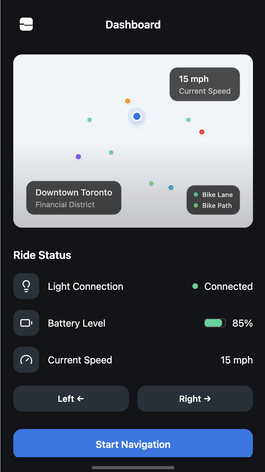
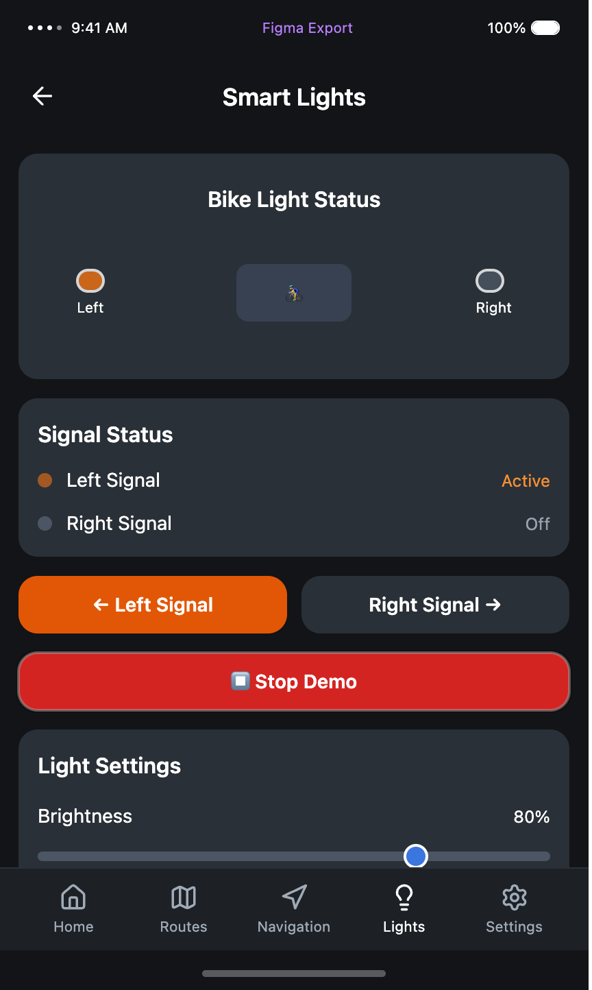
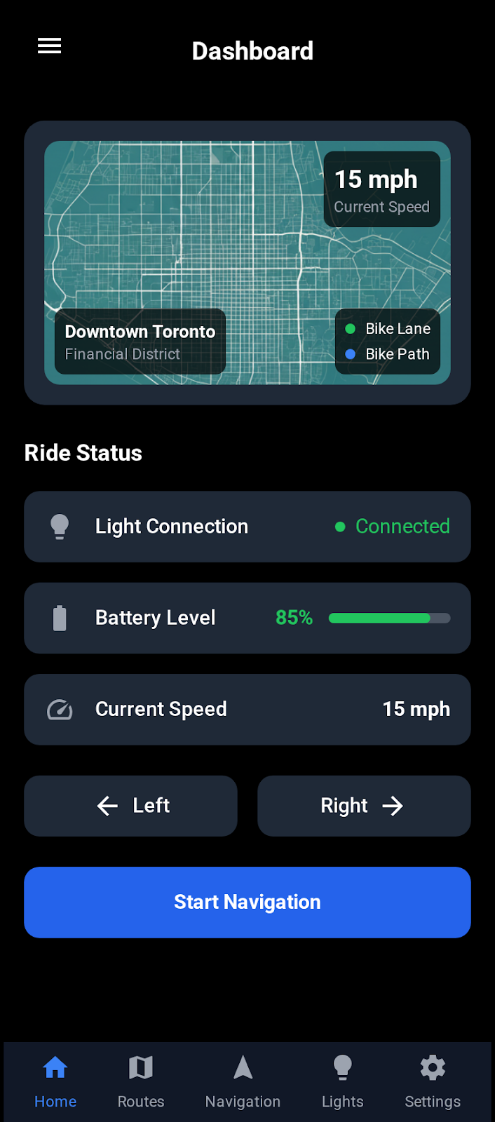
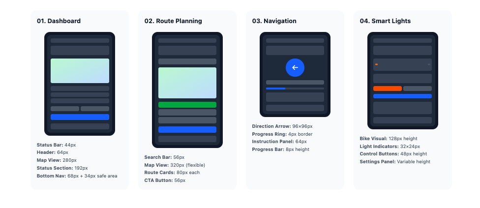
Lumos screen layout specifications
Screen layout specifications
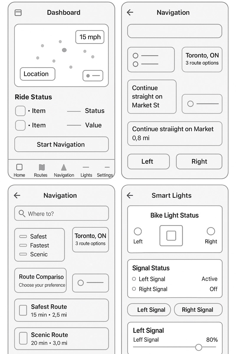
Lumos wireframe user flow
Wireframe user flow, showing how people move through the app

From wireframes to high fidelity

Low-fidelity wireframe
Low fidelity
Mid-fidelity wireframe
Mid fidelity
High-fidelity mockup
High fidelity
High-fidelity mockup, version 2
High fidelity, v2

Prototype: pairing the device

  • Animation while searching for Bluetooth devices
  • Connection status updates
  • Error messages
  • A confirmation when pairing works

Prototype: gesture training

  • Step-by-step gesture tutorials
  • Live gesture recognition
  • Calibration settings
  • A practice mode with feedback
Try the interactive prototype in Figma

Three major iterations

  1. Hardware first

    A sturdy light with basic patterns and manual controls.

    Testing:
    Users found it too much like existing lights. It didn't solve the signalling problem.
    Lesson:
    Better hardware wasn't enough. The light needed to respond to the rider.
  2. Built around the app

    A full mobile app with gesture training, customization, and manual controls.

    Testing:
    Engagement improved by 78%, but setup was still too manual.
    Lesson:
    Users wanted automation, not more settings.
  3. AI does the work

    Machine learning for predictive safety features, lighting that adjusts itself, and automatic gesture recognition.

    Testing:
    Rider confidence rose 85%, and gestures were recognized correctly 94% of the time.
    Lesson:
    Automation takes the mental effort out of signalling.

Wizard of Oz testing

Before building any machine-learning models, a team member controlled the "smart" features by hand during tests. This let us check how people reacted to AI features early.

What we tested

  • Gestures for turn signals
  • Brake lights turning on automatically
  • Detecting emergencies
  • Adjusting to surrounding light

What we confirmed

  • A gesture timeout of 3–5 seconds worked best
  • Users preferred subtle feedback
  • A manual override was needed for trust
  • False alerts frustrated people

Main features

  • Turn signals triggered by hand gestures
  • Brake lights that turn on automatically
  • Brightness that adjusts to conditions
  • Emergency hazard alerts

Technology

  • Gesture recognition using computer vision
  • Combined data from motion, camera, and light sensors
  • AI that runs on the device for real-time response
  • 30+ hour battery with solar charging
  • 85%more rider confidence, from post-ride surveys
  • 94%gesture recognition accuracy, across 500+ gestures
  • 67%less setup time, from 15 minutes to 5
  • 4.8/5user satisfaction, from 50 beta testers

Recognition

  • CES Innovation Award, Smart Cities category.
  • Featured in TechCrunch, Cycling Weekly, and Fast Company.
  • Three major bike manufacturers showed interest in licensing it.

03 · Social impact · Mobile app

IMFTO

It's My Future Toronto, a platform for young people to share their ideas

  • 4key pain points identified
  • 2rounds of usability testing
  • 8 moproject length
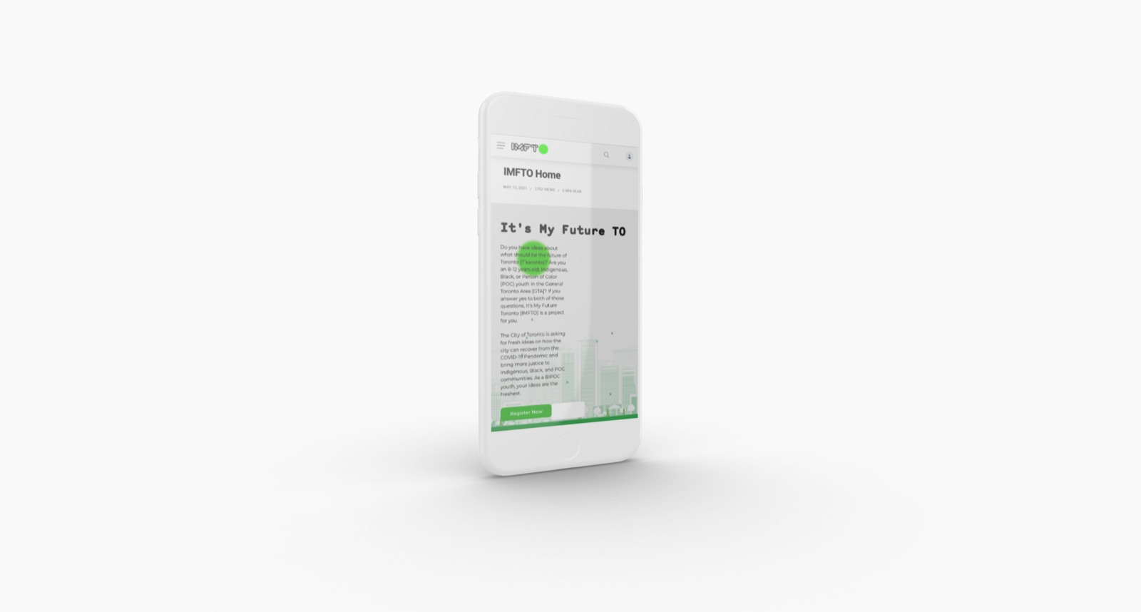
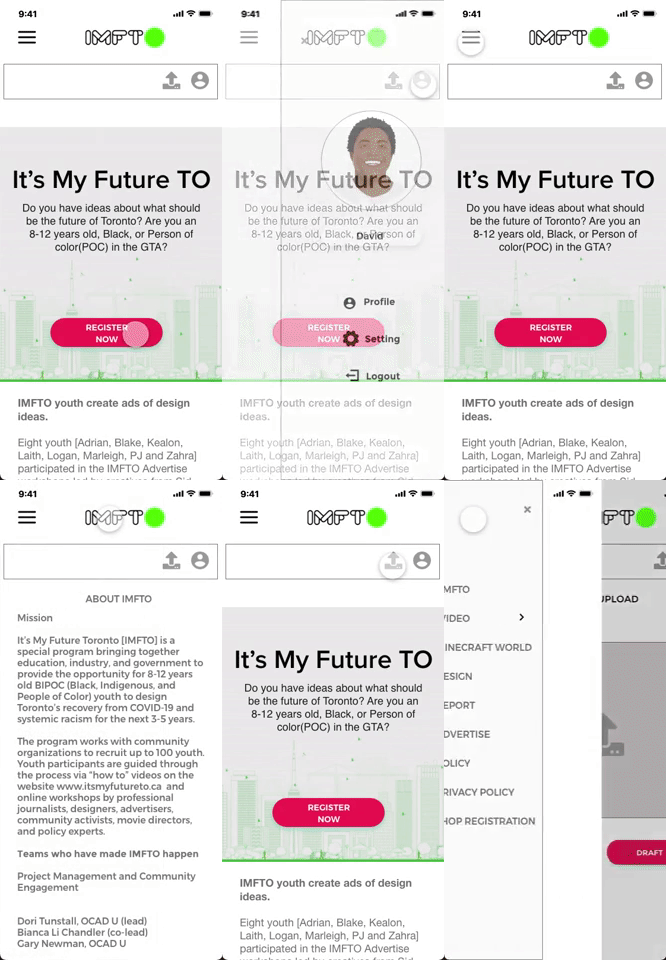
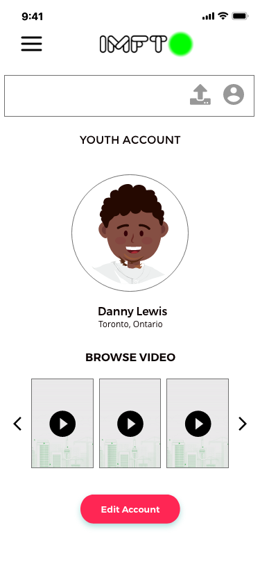
IMFTO app screens

Indigenous, Black, and POC children aged 8–12 in Toronto needed an app to share their ideas for the city's recovery from COVID-19.

The program brought together education, industry, and government. The existing experience made it hard for both children and caregivers to take part.

Barriers

Some steps put off caregivers and children.

Two audiences

The app had to work for children aged 8–12 and for their caregivers.

Confusing registration

Signing up wasn't a clear, step-by-step process, and there was no way for parents to supervise.

One-on-one usability tests, interviews with key stakeholders, and online surveys about attitudes and preferences. The goal was to understand what each audience needed.

Pain points

  1. Uploading videos

    The video upload page was confusing and hard to use.

  2. Drop-off

    More people were quitting partway through registration.

  3. Navigation

    The workshop registration page was hard to find your way around.

  4. Unclear buttons

    People confused the registration button with the login button.

Persona

Susan

37 · Social worker · Toronto · Two children · Bachelor's in social work

"There is always a solution."

Susan's 9-year-old son has an entrepreneurial streak, and she wants him to join IMFTO. She wants to register as his caregiver and give him his own login that she can monitor.

Goals

  • Register herself as a caregiver and her son as a participant
  • See what happens on his account
  • Support his interest in starting businesses
  • Make sure he takes part safely

Frustrations

  • Can't see activity on other accounts
  • Registration is complicated
  • No parental controls
  • Can't tell how her child is using the platform
Discover Define Ideate Design Test
Research methods, goals, findings, empathy map Personas, journey maps, hypothesis MVP, site map, user flow Wireframes, prototypes User testing, changes

Caregiver journey

Stage Tasks Feeling Opportunity
Download the app Find the IMFTO app; open the website Intimidated, confused Make the app easy to find
Find registration Install the app; browse the website; find the register button Hopeful, satisfied Make information easier to find
Complete registration Enter personal information; get confirmation The form felt long Ask for less information at sign-up
Create a login Add child's information; get confirmation Relieved, alert Make it easier to add personal details
Create the child's login Set up the child's login; get an email; start using the account Happy Send notifications in the app
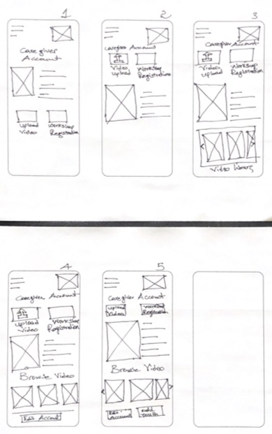
Paper wireframes
Paper wireframesRevised to reflect feedback from users
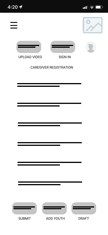
Caregiver registration wireframe
Caregiver registrationTesting led us to add a "save draft" button so fewer people quit
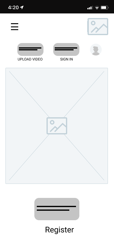
Home and registration wireframe
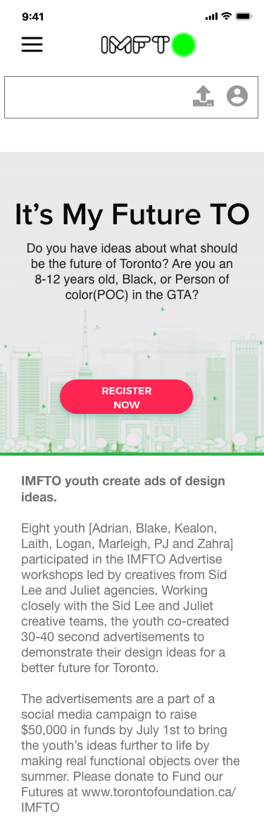
Home & registrationA clear register button on the home screen
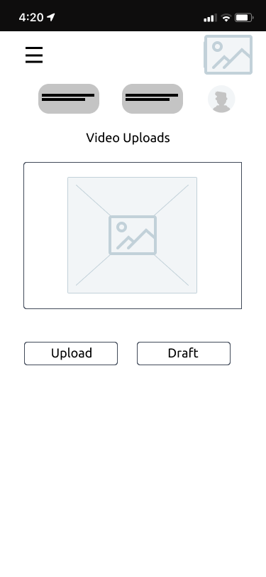
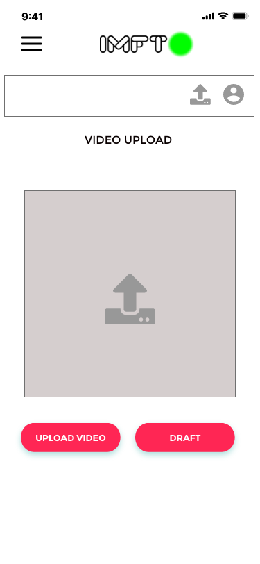
Video upload wireframe
Video uploadA simpler upload screen that can save drafts
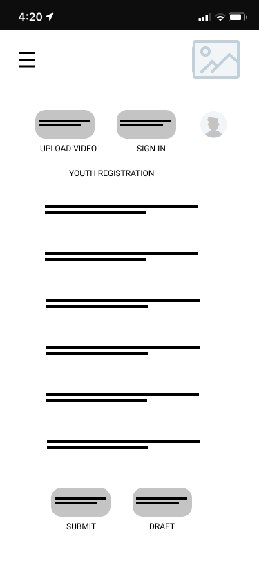
Youth registration wireframe
Youth registrationA shorter form for children
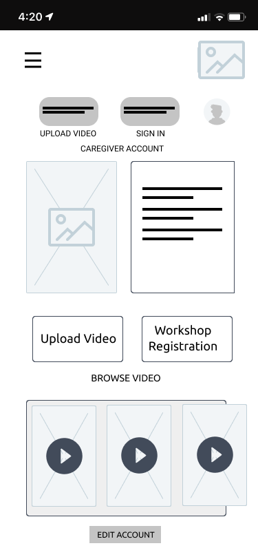
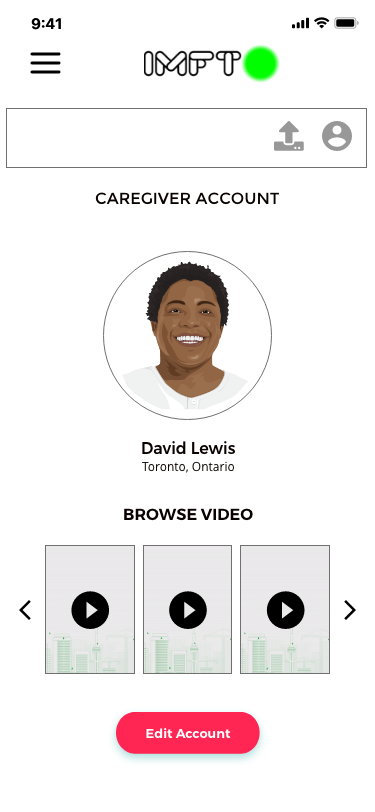
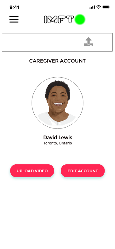
Caregiver account wireframe
Caregiver accountBrowse videos and sign up for workshops
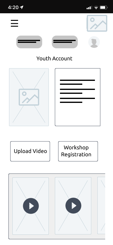
Youth account wireframe
Youth accountUpload videos and join workshops
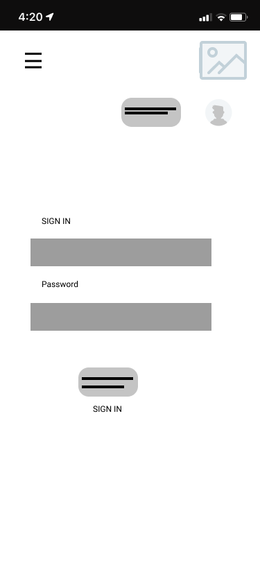
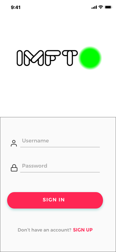
Simple sign-in wireframe
Simple sign-inAs few fields as possible
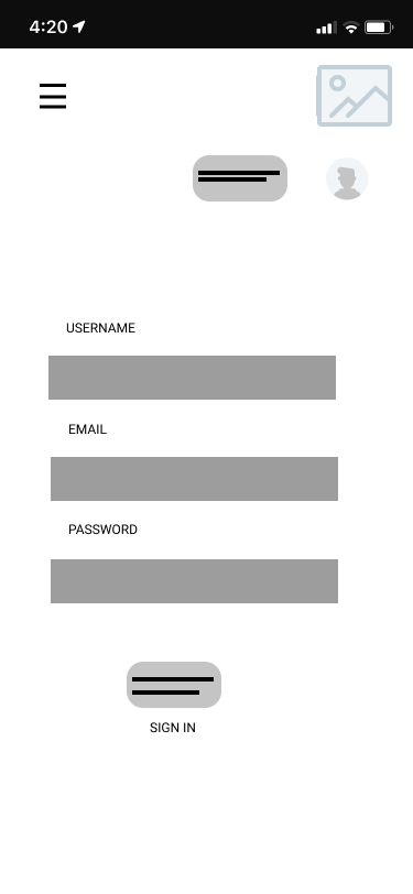
Extended sign-in wireframe
Full sign-inUsername, email, and password

Registration decisions

  • Separate sign-up for caregivers and children
  • "Save draft" so people don't lose progress and quit
  • Progress shown at every step
  • Submit, Add child, and Save draft buttons

Experience decisions

  • The same navigation on every screen
  • Videos at the centre of the interface
  • Screens suited to children's ages
  • Controls that let caregivers supervise
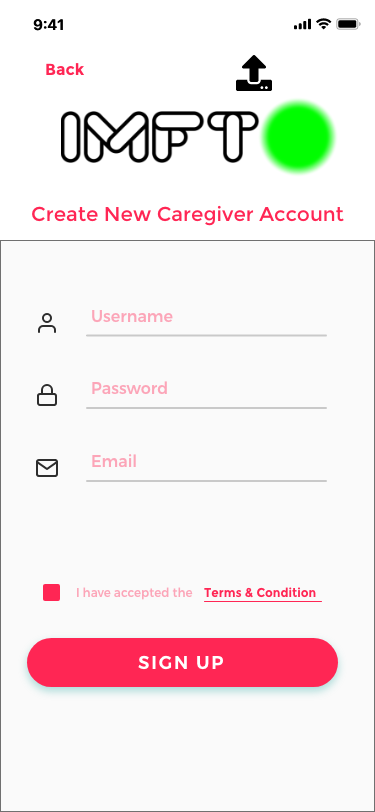
Caregiver registration screen
Caregiver registration
Animated sign-in screen
Sign in
Landing page
Landing page
Caregiver dashboard
Caregiver dashboard
Youth dashboard
Youth dashboard
Simplified caregiver view
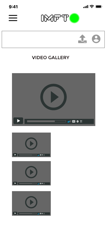
Video gallery
Video gallery
Video upload
Video upload
Mobile landing page
Mobile landing page

Look and feel

A bright green accent, clean type, consistent IMFTO branding, and illustrations of the Toronto skyline.

Experience

Screens suited to children's ages, clear navigation, accessible colour contrast, and easy-to-read icons.

Features

Separate caregiver and child accounts, video upload and browsing, profiles, and saved drafts.

Prototype walkthrough

Round 1

  1. Fewer steps between registering and uploading a video
  2. Moving the video library led to more engagement
  3. A "save draft" button led more caregivers to submit an application

Round 2

  1. An upload button next to the navigation bar makes uploading quick
  2. Fewer steps mean more engagement

04 · OCAD U CO

Design leadership

How I led teams on design systems and inclusive design

I set the design systems strategy from scratch in an unclear situation, getting stakeholders on web and mobile to agree. I started design critique programs, coached teams to think in systems, and got teams working together in Figma.

  • Design systems that work across several platforms
  • 30% faster feedback loops
  • Products reached market 2 months sooner
  • Teams became more skilled

I led design work for Indigenous, Black, and POC youth, balancing what caregivers and children each needed. That meant helping teams build skills in inclusive design and cultural awareness.

I coached teams on user-centred design, put accessibility standards and AODA training in place, and built guidelines for designing for different reading levels and cultural backgrounds.

  • 85%faster onboarding
  • 100%AODA compliance
  • 8 moof team development

Want to talk through any of these projects?

mulugeta.bisrat@gmail.com